
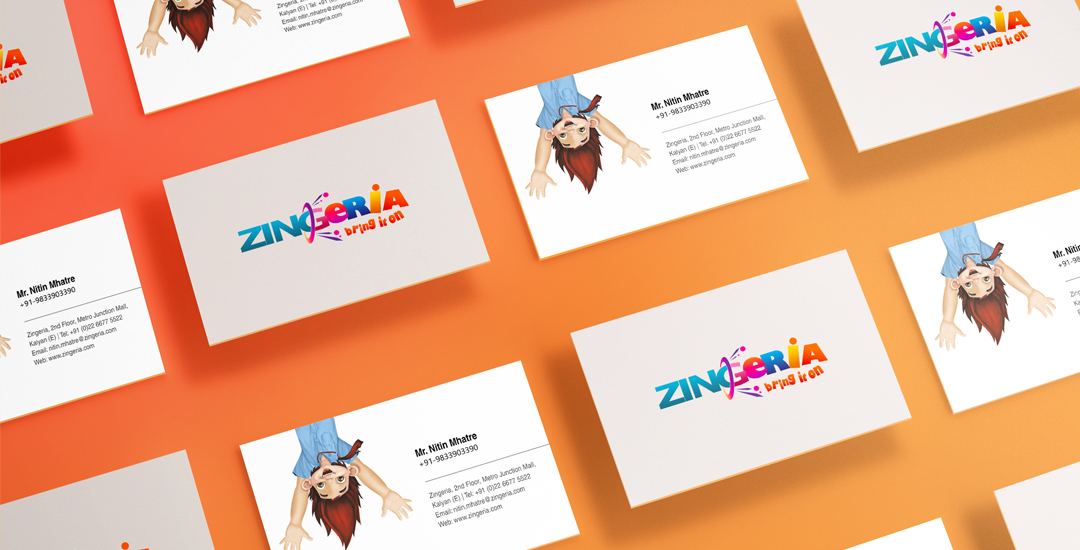
The colourful font stands for the vibrancy of life. It denotes a lively, happy and energetic life. Moreover, the concept of purple ring placed around the letter ‘G’ signifies an entrance to fun, excitement and happiness.In a way, one feels energized and totally refreshed (depicted by the usage of vibrant colours). There is a noticeable change purposely done to the font of ‘Zing’ and when it passes through the purple ring, it transforms and refreshes the state of mind and energy.
ZING + AREA = ZINGERIA Coined from the word “zing” which means high energy and “Area”
Let’s come and take the challenge The tag line itself represents the energy factor such as excitement, enjoyment, fun & thrilling experience.
We are always interested in connecting with new people who share our passion for making brands fly.
If that’s you just send us an email with your CV, portfolio and a beautifully written cover letter.
Copyright 2018 - Bluebones Advertising. All rights reserved.


